The importance of color matching in various box designs
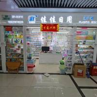
In today's fiercely competitive market environment, the importance of product packaging as the first visual gateway for consumers to access goods is self-evident. In this visual feast, color matching is undoubtedly a key element in attracting attention and conveying brand concepts. Especially in various box designs, the clever use of color can not only enhance the overall beauty of the product, but also stimulate consumers' desire to purchase and shape a unique brand image. Below, we will take Jiajia Daily Necessities Trading Company as an example to deeply analyze the importance of color matching in box design.
1、 The psychological effects of color and emotional resonance
Color is not only a visual stimulus, but also a transmitter of emotions. In the box design of Jiajia Daily Necessities Trading Company, every color selection is carefully considered to resonate with the psychological expectations of the target consumer group. For example, warm pink colors are commonly used in the packaging of household items to create a comfortable and cozy home atmosphere; And fresh green is often used in products with environmental or natural themes, conveying the brand concept of health and nature. Through the psychological effect of color, Jiajia Daily Necessities Trading Company effectively narrows the distance with consumers and enhances the brand's affinity.
2、 Creating color contrast and layering
In box design, color contrast and harmony are important means of creating visual hierarchy. Jiajia Daily Necessities Trading Company cleverly applies the principle of color contrast, such as the interweaving of cool and warm tones, differences in brightness and darkness, etc., to make product packaging stand out on the shelves. At the same time, through the orderly arrangement and transition of colors, a rich visual hierarchy is constructed, guiding consumers' gaze flow and deepening product impressions. This design not only enhances the aesthetics of the product, but also strengthens consumers' memory points.
3、 The unity of color and brand image
Color is an important component of brand image, which can help consumers quickly identify and remember the brand among numerous products. Jiajia Daily Necessities Trading Company is well aware of this, and therefore insists on using a unified color system in the box design of all its products, forming a unique brand recognition. This color consistency not only enhances the overall image of the brand, but also deepens consumers' awareness and loyalty to the brand. In the bustling commercial area of 13th Street on the second floor of Gate 87 in Zone 4 of Yiwu International Trade City, Jiajia Daily Necessities Trading Company has successfully attracted the attention of many consumers with its unique color matching strategy.
4、 Matching color matching with market positioning
Products with different market positioning require different color matching strategies. Jiajia Daily Necessities Trading Company flexibly adjusts color matching schemes for different consumer groups and market positioning. For example, targeting the young consumer group, using more vibrant and lively color combinations to showcase the fashion sense and vitality of the product; For the mid to high end market, it is more inclined to use low saturation and high-end colors to highlight the quality and grade of the product. This precise color matching strategy enables Jiajia Daily Necessities Trading Company's products to accurately reach the target consumer group and achieve steady growth in market sales.
In summary, color matching plays a crucial role in various box designs. It not only concerns the aesthetics and attractiveness of the product, but also directly affects the brand's image shaping and market positioning. Jiajia Daily Necessities Trading Company has shone with unique brilliance on the fertile land of Yiwu International Trade City through clever use of colors, becoming the preferred brand in the hearts of many consumers.


